You asked, we listened, new look is here. We’ve been heads-down on the biggest update the app has had since launch, and it’s finally here. This release isn’t just a coat of paint – most of it came straight from your feedback. Buttons that were too fiddly to tap, colors that were hard to read, a bottom bar that got in the way of the thing you actually open the app for. We heard all of it.
Here’s what’s new.
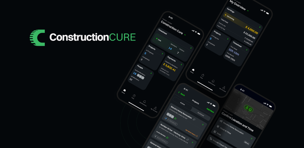
A bottom bar that works the way you do
The number one thing you asked for was a better way to clock in. The old bar treated every button the same, even though clocking in is the reason most of you open the app. So we rebuilt it around that.
- Clocking in is now front and centre. One big, obvious button in the middle of the bar. Tap it and you’re on the clock. No menus, no extra taps.
- The button turns into your timer. Once you’ve clocked in, that same button shows how long you’ve been working — counting up as you go. When you’ve passed your scheduled hours, it changes colour so you can see it at a glance.
- Clearer icons, easier to read at a glance. Home, Alerts, Materials, More, and your Account each got a fresh icon. Easier to spot, even with dusty hands and one eye on the job.
- Smoother to use. Moving between sections feels quicker, and the app remembers where you were when you come back.
If you only notice one thing in this release, it’ll be this.
A fresh new look
We also gave the whole app a visual refresh. Same dark look you’re used to, just done properly this time.
- Easier on the eyes. Text is sharper and easier to read, especially on the overtime, project, and profile pages where some of you told us things were too washed out.
- More consistent. Every page now looks like it belongs in the same app. Same backgrounds, same buttons, same spacing. No more surprises when you jump between sections.
- Important things stand out. The colours for action buttons and warnings have been tuned so the things that matter catch your eye, without the rest of the app shouting at you.
Cleaner buttons, forms, and pop-ups
While we were at it, we tidied up pretty much everything you tap on day to day: buttons, text fields, checkboxes, badges, profile photos, pop-up menus, and more. Most of it will feel familiar, just a little nicer to use.
Small touches that add up
- Invitations open as a quick pop-up instead of a full page, so you can accept or decline and get straight back to what you were doing.
- Notification permissions are now a two-step ask, so it’s clear why the app needs them.
- Friendlier success screens after you create a company or a project – better-sized text, easier to read.
What’s next
This was the groundwork. With everything looking and feeling right, we can ship improvements faster from here – expect smaller updates more often. Keep the feedback coming.